Design studio SomeOne rebrands Saga
by IBRAHIM
Design studio SomeOne rebrands Saga
Design studio SomeOne has crafted a new identity for the brand, which aims to “embrace a positive view of life over 50”.
London-based studio SomeOne has rebranded over 50s company Saga, hoping to showcase a “more positive side of getting older”.
Saga was founded in 1951 and provides insurance, travel and financial services for those aged 50 and over.

The strategy for the rebrand was informed by insights from Saga members, explains SomeOne co-founder Simon Manchipp.
According to a Saga survey, 70% of over 50s feel that “representation of them is unfairly focused on age alone”, explains the designer.
Further polling revealed that two thirds of Saga customers prefer a brand that “embraces a positive view about life over 50, focused on experience rather than age”.
The new strategy aims to uncover what old really means when it comes to age, explains Manchipp, adding that it “playfully questions why we call people ‘old’, as opposed to calling a jacket ‘vintage’, a cheese ‘mature’ or a car ‘classic’”.
The updated identity also seeks to embrace digital channels in an attempt to get closer to Saga’s customers, he explains.
“Made with care, and made to last”
The redrawn wordmark was inspired by railings found at Saga’s first hotel. “The arcs and shapes from the ironwork led us to develop a new bespoke wordmark with curved crossbars on the letter ‘A’s”, says SomeOne senior designer Ian Dawson.
The ornamentation also led to a new signifier symbol for the brand, which is used occasionally throughout the identity. “It’s designed to offer moments of reassurance rather than lead the branding,” Dawson adds.
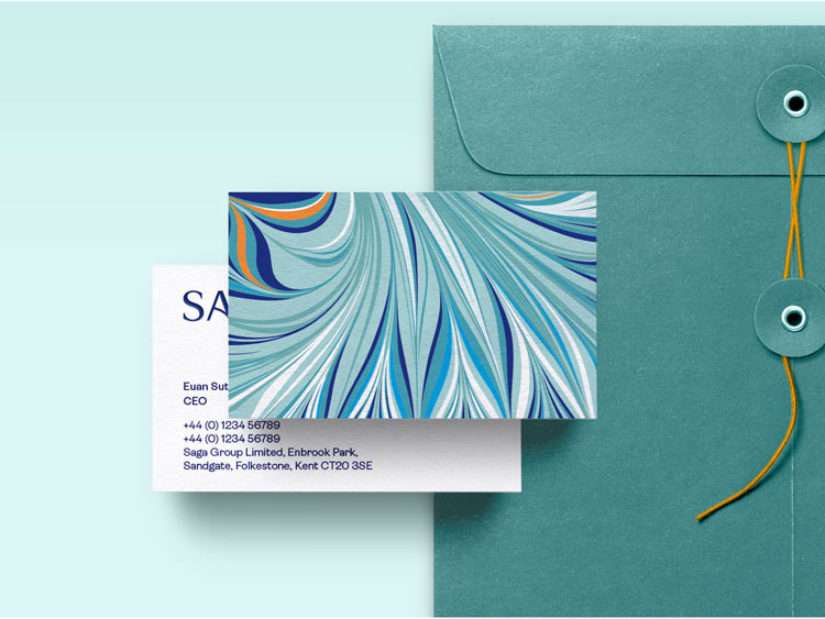
One of the most significant aspects of the new identity is the use of marbling. Dawson calls this a “timeless visual theme”, which can be seen on stationery and other branded materials such as umbrellas.
The visual element was tested on customers and “universally seen as a compelling way of connecting the brand’s offers with enduring value, quality, and high level of service”, says Dawson.
SomeOne worked with London-based marbling specialist Lucy McGrath on the patterns. McGrath is founder of Marmor Paperie, a studio which designs marbled products and stationery.
The marbling is also part of Someone’s attempt to create new associations with the age group, according to Simon Manchipp. “The visual theme of marbling brings with it instant associations with high quality items that are made with care, and made to last,” the designer adds.
A new typographic system has also been designed for Saga’s rebrand, with a focus on editorial applications such as the company’s magazine.
“Typography plays a particularly key role in the brand’s success,” Manchipp adds. Sans serif typeface Ambit (from CoType) is primarily used, while Signature from A2-Type is the supporting typeface.
A supporting campaign called Experience is Everything has been created by VCCP.
What do you think of Saga’s rebrand? Let us know in the comments below.
Recommended Posts

NB invites local designers centre stage for Vineyard Theatre rebrand
February 24, 2023

“AI revolution” will change way design studios look within three years
February 24, 2023
Rbl rebrands ZSL with ecosystem-inspired identity
February 23, 2023