Design in 2023 – what will packaging design look like this year?

by IBRAHIM
Design in 2023 – what will packaging design look like this year?
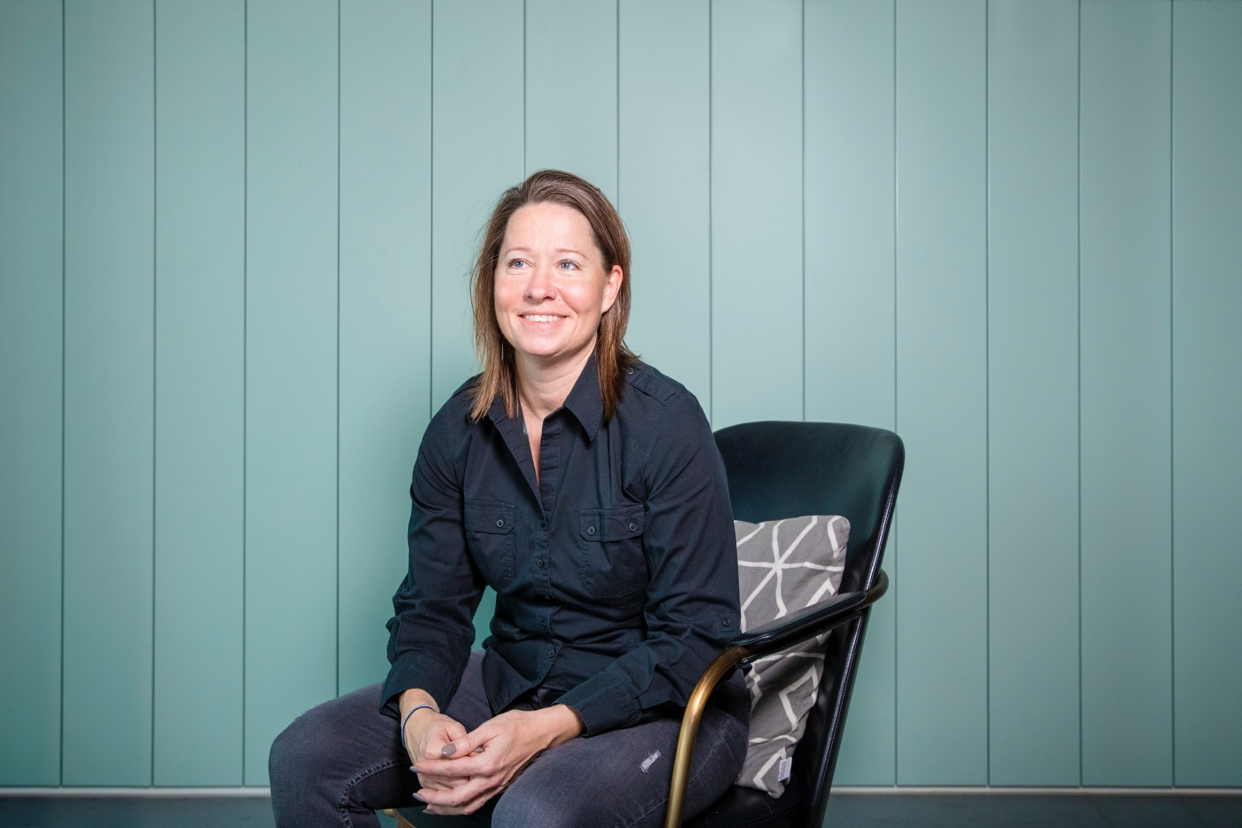
As part of our series on design in 2023, Coley Porter Bell creative director Sam Stone shares what she predicts for packaging design this year.
What will packaging design look like in 2023?
In 2023, I believe we will continue to see brands succeed by tackling two things.
Firstly, by challenging the traditional category codes associated with FMCG brands and evolving towards a more contemporary, sometimes rule-breaking approach.
There are thousands of products to choose from on our supermarket or virtual shelves and it only takes a few seconds for consumers to either choose your product – or continue browsing along the aisle or scroll down their mobile device instead.
The expression of many FMCG brands has challenged established expectations in recent years, and in addition the fast rise of innovative, direct-to-consumer brands has fuelled an even more rapid revolution. There are particular FMCG categories with outdated codes, and brands such as Nice Cream, Burgen, Border Biscuits, Waken and Plenish have all simplified to amplify, rapidly changing our perception of embedded approaches. Gen Z are looking for fundamentally different aesthetics and values to those of other generations. Brands must stand out, and for the right reasons.
For a while, FMCG brands that have been mostly experienced through packaging are finally evolving towards creating immersive brand and product experiences, by creating ownable equities like music, sound and motion as well as improving their digital and content presence. I’m thinking of brands like Billie, Grind and Lick.
Secondly, we hear every day about how our world is congested and fast-paced. The FMCG brands that are simple and bold are the ones that will stand out. The well-embedded phrase ‘simplify to amplify’ is becoming more and more poignant as our worlds become increasingly sensorially congested. Brands need to carefully and strategically remove the usual clutter of busy, over-packaged products with overloaded listings of ingredients, benefits and promises, and focus on making the product speak for itself – by peeling away what is irrelevant to sharpen the brand down to its true essence on the packaging, both visually and physically.
What was your favourite packaging design project from 2022?
So many to choose from, but I did admire the Ecover rebrand by Design Happy. From its original launch in 1979, the Ecover brand had always sought to be a category-changing pioneer but had gradually overloaded its label with too much information, flowery detergent clichés and old fashioned eco codes, all of which overshadowed the original brand purpose of a being a fearless eco warrior in its values and spirit.
The new design is vibrant and striking on shelf with simple information and a bold and confident personality. It’s a perfect example on how to maintain your leadership position by being brave and true to a clear brand purpose.
Recommended Posts

NB invites local designers centre stage for Vineyard Theatre rebrand
February 24, 2023

“AI revolution” will change way design studios look within three years
February 24, 2023

Rbl rebrands ZSL with ecosystem-inspired identity
February 23, 2023


