Derek&Eric designs “planet kind, heavy duty” identity for compostable refuse bag brand
by IBRAHIM
Derek&Eric designs “planet kind, heavy duty” identity for compostable refuse bag brand

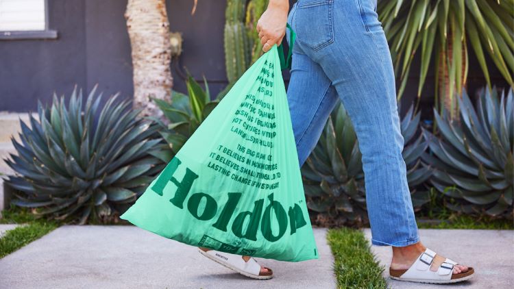
HoldOn’s wordmark references a tied bag, while the bin bags feature copy in a bid to influence consumer behaviour.
Derek&Eric has designed the identity and packaging for new compostable refuse bag brand HoldOn around the idea of being “planet kind, heavy duty”.
HoldOn’s bin bags and sandwich bags are made from a mix of corn starch, plant-based renewables and non-toxic materials, making them 100% compostable. Within weeks of disposal, the bags will break down into humus – a rich and important part of all soils. This presents a greener solution than biodegradable bags, which can take months or even years to break down, leaving behind several different materials and some toxins.
According to Derek&Eric managing partner Jon Gibbs, the studio liked that this “small and humble idea” could have a “transformational impact on consumer behaviour and the ecosystem”. The challenge was that “buying bin bags is not a task that most people think much about”, which is something that HoldOn wants to change, says Gibbs.
Though HoldOn now can be purchased in stores, it started primarily as an online consumer brand, so the identity had to be “really clear” and “jump off people’s screens”, Gibbs explains.
The studio also considered that most existing eco-category bin bags “aren’t up to the job” and routinely break, says Gibbs, so “hefty, unsustainable black bin bags” are often favoured. To counteract this stereotype, Derek&Eric’s aim was to craft a bold typography-led identity with a bespoke hand-drawn wordmark at its centre.
Designed to display the strength of the bags, the wordmark works alongside “visual codes of protest movements” in its ad campaign, says Gibbs. He adds that HoldOn’s “empowering tone of voice”, crafted by copywriter Peter Albores, is “at the heart of the identity”.
The message of strength is balanced by “moments of visual wit”, explains Gibbs, such as the trash bag ‘O’ in the wordmark and the “disappearing typography”. Gibbs says the latter is meant to reflect how the product itself is “designed to disappear”, so the logo can be seen fading away on some products and posters.
He adds that the ‘O’ bag icon is more present across digital touchpoints than on packaging and seeks to be a “distinctive asset” that people will remember.
People looking for greener solutions often look for the colour green as a “code”, says Gibbs, and while the studio wanted to keep to this code, HoldOn needed to stand out from other eco brands. The solution was opting for a “sympathetic natural green” similar to that of the ocean, rather than “artificial greens”, says Gibbs.
HoldOn’s new identity has rolled out across its primary touchpoints – the ecommerce site and social media – as well as packaging, ads and merchandise.
Recommended Posts
Norfolk Coast logo and identity by Lantern
November 23, 2023
SeidrLab visual identity by Mubien Brands
October 16, 2023
Jarrolds logo and identity by The Click
October 5, 2023