DAO start-up Metaphor’s branding aims to defy “techy tropes”

by IBRAHIM
DAO start-up Metaphor’s branding aims to defy “techy tropes”
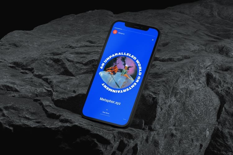
Stencil illustrations from 70-year-old public domain images aim to give Metaphor a “1950s scifi” feel.
Wildish & Co has rebranded DAO platform Metaphor, with space race-inspired illustrations designed to make web 3.0 (the third generation of web technologies) more accessible.
A decentralized autonomous organization (DAO) is a program running on a blockchain which uses a set of rules written down in code to operate and is not influenced by a central authority. Instead, a DAO takes a bottom-up approach enabled by members across a network of computers running shared software. To become a member of a DAO, users need to join by buying its cryptocurrency, which then gives them the power to vote on proposals and updates, proportional to the amount they hold.
DAOs are growing in popularity because they are completely transparent, meaning all financial actions or funding is viewable by anyone at any time.
“At the moment if you want to join a DAO you have to set up your own wallet, go out and find out what you want to buy in to and then figure out how to join it with little guidance,” says Wildish & Co managing director Sam Fresco. He explains that Metaphor’s main function is to “simplify DAO onboarding through a clear, unified experience” for connecting a wallet, choosing a membership type, and token purchasing.
Essentially, it’s a type of “learn while participating” platform, which does not assume that its users have prior knowledge of DAOs or web 3.0, Fresco adds.
The initial brief from Metaphor specified that it wanted to ditch its “dark and moody” branding to differentiate itself from other blockchain platforms. According to Fresco, the platform chose Wildish & Co because it had not worked in the web 3 space before, meaning the team could approach the project with no preconceptions.
The illustrations do a lot of “the heavy lifting” in the rebrand, says Fresco. Wildish & Co aims to create a “generative brand” through having more than 200 backgrounds and around 1000 avatar illustrations to choose from which can be combined to create different scenes.
“Over time this means Metaphor can keep building and building on its content assets themselves,” says Fresco. Cutting out avatars and objects from old images in the public domain, the studio created stencils that fit into the themes like space, exploring, and astronauts.
Images over 70 years old automatically enter the public domain image bank, which is why the illustrations have a “nostalgic Americana feel”, says Fresco.
In attempt to add to the “retro look”, the studio added a Photoshop effect over the top of the images. This 1950s sci-fi allusion is meant to “encourage people to be excited about web 3.0 in a similar way to how people were excited about technology during that period,” says Fresco.
One of the finer points of the illustrations is that you never see a person alone in the imagery – there are always at least two people together. “This is meant to represent how you’d never be working alone in a DAO and how we’re all exploring the unknown together,” Fresco adds.
The archway icon within Metaphor’s wordmark is also meant to convey an accessible learning experience and symbolise the two sides of the business. Fresco says, “The steps are meant to represent the steppingstones of education while the doorway is meant to depict the bridge between what you already know and the unexplored world of web 3.0 that’s out there.”
He adds that Metaphor wanted to avoid “black and grey gradient backgrounds and techy squared fonts”, which featured in its old branding. In attempt to defy these web 3.0 branding tropes, the platform opted for bright hues of blue, pink and red.
Wildish & Co also chose the smooth-edged Right Grotesque font in the weight Spatial Black for headlines and uppercase text and Inter Medium by Google Fonts for all of Metaphor’s main communications and print media.
Metaphor’s new branding will launch later this year across its online platform, social media, merchandise, and communications.
Recommended Posts

NB invites local designers centre stage for Vineyard Theatre rebrand
February 24, 2023

“AI revolution” will change way design studios look within three years
February 24, 2023
Rbl rebrands ZSL with ecosystem-inspired identity
February 23, 2023