Counter-Print’s new publication shows the process behind the making of logotypes
by IBRAHIM
Counter-Print’s new publication shows the process behind the making of logotypes
Process: Visual Journeys in Graphic Design delves into the creative process at Swedish graphic design studio BankerWessel.
British art and design publisher Counter-Print has just released Process: Visual Journeys in Graphic Design (Second Edition), a book that highlights “the rarely shown sketching and process behind the making of marks and logotypes.”
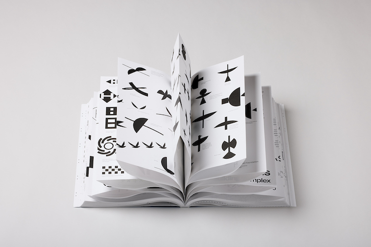
Based on the work of Swedish graphic design studio BankerWessel, Process explores fourteen of the studio’s projects, including over 1,500 sketches and accompanying annotations that give a rare insight into the creative journey.

This publication follows the first edition of Process, which was released in 2019 and worked with the same concept, taking a deep dive into the behind-the-scenes of BankerWessel’s research-driven practice.
Speaking on the inspiration behind the books, BankerWessel creative directors and designers Jonas Banker and Ida Wessel say getting “appropriately paid” was a driving factor: “We wanted to show that our work had depth and was worth paying for.”
They add, “To do that, we needed to capture our process from the beginning to the end and present it so that everyone could understand – clients, parents, even our kids!”

This meant shining a light on the often-overlooked stages of creation, including the thousands of rejected drafts that don’t make it through, they explain. These stages are frequently non-linear and frustrating and it was this aspect of the design process that BankerWessel were keen to accurately depict.
“The way the design process was generally described felt a bit off,” says Banker. “Sometimes it was shown as a schematised, almost automatic pursuit, other times with a romantic aura – like a quick sketch with a Bic pen on a restaurant napkin. But we wanted to try to capture a more thorough picture, which made us come up with the idea of presenting the thought process right next to our sketches.”

In the book, these sketches number in the thousands, and yet only 14 of them are final, finished products – “that is a lot of rejection,” notes Wessel. It was important to the team that these unrealised versions take centre stage, revealing the driving force behind the search for “those little gems and hidden solutions”.
In this second edition, two new projects join the already extensive collection: the studio’s work for Upotential, a gym for mental fitness; and for Frederik Mattson Verkstad, a Swedish furniture designer.

These projects, like the others, are presented in black and white, to reflect the beginning stages of the creative process, where BankerWessel always works without colour. The lack of typography also allows the focus to remain on the marks themselves, according to the design team.
“After gathering all the sketches, we added the thought process as a second layer,” says Banker. “It was quite astonishing how easy it was to backtrack our thoughts. It all felt very recent and still made sense.”

The annotated sketches are printed on French-folded paper, again speaking to the various stages of design which “move back and forth” and “create currents and breadcrumbs”, the designers say. These connected pages mimic the linked processes that the team goes through before reaching a final design.

What do you think of this project? Let us know in the comments below.
Recommended Posts

NB invites local designers centre stage for Vineyard Theatre rebrand
February 24, 2023

“AI revolution” will change way design studios look within three years
February 24, 2023
Rbl rebrands ZSL with ecosystem-inspired identity
February 23, 2023