Collins rebrands OpenWeb – Design Week
by IBRAHIM
Collins rebrands OpenWeb – Design Week

The identity of the online platform used by publishers around the world is inspired by 19th century typography and eschews tech company cues.
Collins has rebranded audience relationship platform OpenWeb to aid the company in its mission to “improve online conversations”.
Founded in 2012, OpenWeb is platform which can be used by publishers to host conversations and comments on their online content. Used already by the likes of Hearst, Yahoo! And News Corp, the company has a particular focus on “de-trolling” digital discourse in order to create “powerful and engaged communities”.
“A new strategic foundation”
Collins design director Megan Bowker says the studio was bought in to conduct a “full-on reimagination” of the brand, beginning in late 2019. This includes a new logo, tone of voice and even interface design.
“We worked with their leadership team to invent a new identity, both verbal and visual – based on a new strategic foundation we crafted with them to answer their largest ambition,” she says.
“OpenWeb is not a ‘tech’ company”
The new look is inspired by 19th century typography and newspaper headlines, Bowker says. This move was a deliberate rejection of the aesthetics that other internet brands currently embrace, she explains.
“From the beginning of the project, we believed OpenWeb was not a ‘tech’ company—it’s a conversation company,” Bowker says. “So not feeling or looking like an interchangeable, shiny ‘tech’ company is exactly where we needed to be.”
As well as setting it apart from other digitally-focused companies, Collins also hopes its nod to print communications of the past will help OpenWeb further resonate with publishers.
“Plays with the tension between the digital and physical world”
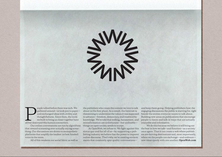
A minimalist logo sits at the centre of the project, comprised of seven W’s which form an O. The studio says the emblem “symbolises harmony and exchange”.
On the OpenWeb website itself, the team has adopted an editorial look and feel. An off-white background colour evokes the colour of newspaper, and a serif typeface further emphasizes the idea. Different cross-heads also appear in different headline-style typefaces, evocative of print media.
Using these visual references for a company that ultimately exists online “plays with the tension between the digital and physical world and this issue of quality and trust,” Bowker says.
“We hope it serves as a breath of fresh air”
Supporting the editorial aesthetic approach is a collage-like digital technique for displaying images. The studio says the approach marries “centuries-old visual styles with modern digital technology and motion design”.
The image approach uses a grid to intertwine libraries of open-source content. The resulting mash-up “reflects diverse conversations”.
Underpinning the whole look is a new tone of voice which is designed to be clear and concise, in order to cut through the “trolls, feuds, reactivity, misinformation, hostility, rancour, outright lies and deceit”, which Bowker says has come to define our time online.
“OpenWeb needed a clear voice that would not just represent their ideal future, but also advance healthier conversations every day,” Bowker says. “It’s something we hope serves as a breath of fresh air in a noisy, eye-popping digital landscape.”
What do you think of OpenWeb’s new look? Let us know in the comments below…
Recommended Posts

NB invites local designers centre stage for Vineyard Theatre rebrand
February 24, 2023

“AI revolution” will change way design studios look within three years
February 24, 2023
Rbl rebrands ZSL with ecosystem-inspired identity
February 23, 2023