CNET’s rebrand takes inspiration from the world of 1950s and ’70s journalism
by IBRAHIM
CNET’s rebrand takes inspiration from the world of 1950s and ’70s journalism

Collins’ new branding attempts to link past and future, with a nod to the mid-20th century and sci-fi illustrations.
Design studio Collins has worked with media website CNET on a complete brand refresh, including a redesign of the news website.
The transformation was prompted by CNET’s decision to extend its subject area beyond tech news. Now covering topics such as money, home, wellness, culture, cars and climate, CNET is hoping to “drive a more broad and meaningful conversation”, says Collins creative director Tom Elia.
According to the studio, the brief was influenced by this change and the rebrand aims to help convert CNET from a tech-review site into a trustworthy, editorial-first news source among its competitors.
Elia adds, “We weren’t supposed to have endless, 60-second news cycles and a firehose of information crossing up our brains. Progress was supposed to improve modern life.”
In an attempt to differentiate CNET from other modern journalism sites, the studio took inspiration from broadcast journalism giants from the 1950s through 1970s. By alluding to these decades, the branding hopes to evoke a time when the “freedom and power of the press” was more respected and public trust was high, says the studio.
The studio also intended to draw on the idea of what people at that time thought the future would look like with the new design. Linking to this is the brand’s marketing approach, which adopts bold surrealist illustrations intended to represent CNET’s ability to spark people’s imaginations, explains Elia.
Collins design director Jump Jirakaweekul says, “We wanted to bridge the past and the future while having those elements still evoke both familiarity and surprise, whether it’s the strong graphic nature of the wordmark or the fantastical nature of the futuristic, almost sci-fi illustration style.”
Collins chose Sentinel as its primary typeface because of its “authoritative and friendly” tone, says Jirakaweekul. “Slab serifs feel confident and attention-grabbing when used at large display scales,” the designer adds.
Jirakaweekul adds, “We also liked that it was a small, subtle nod to the slabs in CNET’s original logo.”
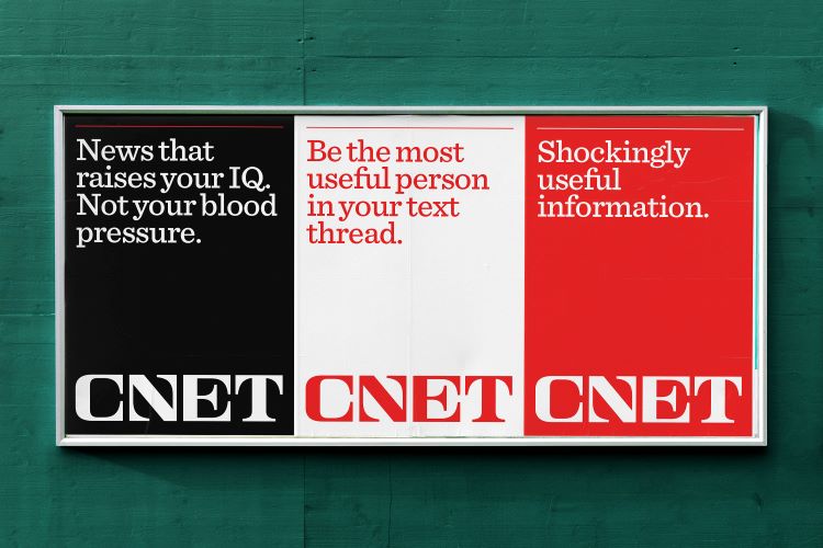
Another core element of CNET’s brand is its distinctive red logo, which the design team has updated with a more “optimistic tone”, Jirakaweekul says.
“We brightened up the red so it felt strong and arresting, but not overwhelming. This is especially true when we use white and the red CNET wordmark,” he adds.
The new branding has rolled out across CNET’s website and communications.
Recommended Posts

NB invites local designers centre stage for Vineyard Theatre rebrand
February 24, 2023

“AI revolution” will change way design studios look within three years
February 24, 2023
Rbl rebrands ZSL with ecosystem-inspired identity
February 23, 2023