“Chaos to clarity”: the Institute of Design’s ever-evolving identity

by IBRAHIM
“Chaos to clarity”: the Institute of Design’s ever-evolving identity

Collins tapped into the school’s history which inspired a new bespoke typeface made up of six basic geometric forms.
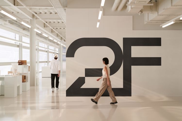
Collins has designed a new identity for the Institute of Design (ID) in Chicago, featuring a constantly shifting logo which aims to “embrace the process of moving from chaos to clarity”.
The change comes ahead of the school’s 85th anniversary and seeks to address its acceleration and represent the ID community more appropriately. According to Collins creative director Joseph Han, its new identity should “better express ID’s comprehensive and integrated approach to design and education”.
To signify both “the methodical and the experimental”, Collins graphic designer Jingqi Fan says Collins built the identity system around six foundational structures inspired by basic geometrics that we encounter every day. He explains how the three “elemental forms” – a line, a diagonal and an arc – can interconnect to create an additional three.
The adaptive nature of ID’s new typeface is a product of the “infinite possibilities” that these structures create, says the studio’s design director Sanuk Kim. Removing the spacing between each letter and each line of text seeks to “reinforce the modularity” of the typography, she adds.
Instead of using recognized typeface weights, such as regular, medium, bold, Collins opted for five “states” – 0, 25, 50, 75, 100 – that “increasingly rotate the modules within each letterform” as it moves from 100 down to 0, says Kim.
She adds: “The goal behind our typography was to visualize and embrace the process of moving from chaos to clarity as it is always evolving and solving itself, just like the constant experimentation that happens at ID.”
To generate ideas for the school’s new brand story, Collins investigated its history and watched The New Bauhaus, a documentary on the life and work of ID’s founder László Moholy-Nagy. Through “experimentation with technology” and merging art and design disciplines, Han says that ID – previously known as the New Bauhaus – “sought to evolve the role of design in society”.
Collins found that the school’s education program was also constantly evolving. From 1955 to 1969 under the direction of industrial designer Jay Doblin, the ID program changed as “systems thinking, design methods and new design theory” were introduced, says Han.
Redefining the role of student and teacher to become “The Evolutionaries” correlated with ID’s history and its vision for the future of the school. Han explains how this led to the conception of “a new voice and a dynamic visual identity” that was always evolving. He adds that the six foundation structures are inspired by “Moholy-Nagy’s artistic experiments with geometry and Doblin’s genius in designing complex systems”.
The Institute of Design’s new website has recently launched as well as key event materials and collateral. Collins has also designed a microsite that allows students, faculty and anybody who has access to the site to experiment and add to ID’s brand identity system. “As we say at Collins, guidelines are not what we design to, they are what we design from and we are excited to see how the new brand will evolve,” says Kim.
Recommended Posts

Norfolk Coast logo and identity by Lantern
November 23, 2023

SeidrLab visual identity by Mubien Brands
October 16, 2023

Jarrolds logo and identity by The Click
October 5, 2023

