Border Biscuit’s “impactful” rebrand – Design Week
by IBRAHIM
Border Biscuit’s “impactful” rebrand – Design Week
Bold colours and a new typeface replace the previous branding’s more traditional, muted style.
B&B studio has rebranded Border Biscuits, with a new look that seeks to emphasise accessibility and the brand’s family values.
The rebrand, which Border Biscuits says is the biggest move in its 38-year history, coincides with the launch of a new chocolate-covered range. The design elements will be rolled out across all products and ranges.
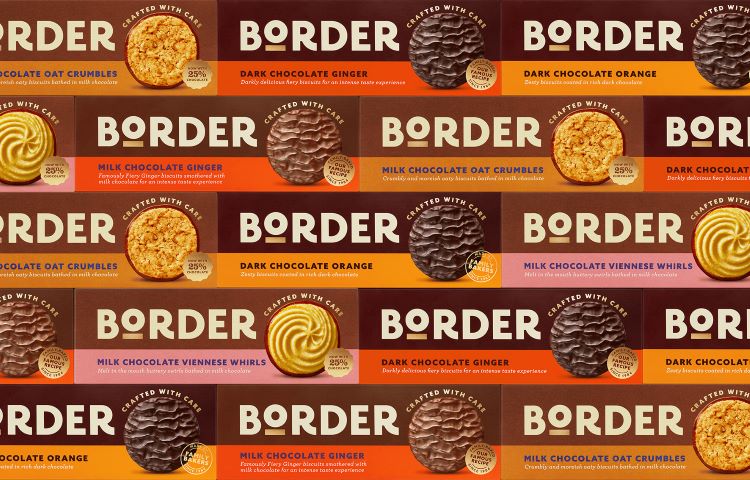
Accessibility and clarity are key elements of the rebrand, which can be seen in an updated bolder logotype, according to the studio. B&B adds that the underlined and elevated o in the logo is designed to reflect the quality of the product.

B&B design director Jack Gibbons says, “Having the confidence to be bold, simple and impactful is crucial for premium accessible brands within a fast-moving retail space.”
Another aim was to reposition the brand to focus more on its heritage as a family-owned business. It now has an updated strapline, Crafted with care, while packaging features copy such as “family baked”.
Another notable difference is the brand’s shift from a neutral beige colour palette to a brighter range of colours like pink, red, and orange. Colourful banners feature at the bottom of the boxes as backdrops for the biscuit name and description.
The studio says the aim is to ensure each biscuit variant can be recognised by its individual shade, meaning “effortless navigation” for consumers.
Gibbons adds, “Maintaining that simplicity while enabling much greater range navigation was perhaps the biggest challenge, but the new design system successfully helps shoppers shop today, while setting the brand up for tomorrow.”
While the removal of the window in packaging means the biscuits themselves are no longer visible on shelf, the brand and studio decided to illustrate the packaging with a product photo. The design team says that this “displays the biscuits in their most perfect state for far greater taste communication”.
The removal of the packaging window was also part of the brand’s attempt to improve sustainability by reducing the amount of packaging needed.
B&B creative partner Shaun Bowen says, “The design was crafted to set strong foundations for new product development. Border has big ambitions, and its existing designs didn’t have the stretch or impact to deliver on innovation.”
What do you think of Border’s rebrand? Let us know in the comments below.
Recommended Posts

NB invites local designers centre stage for Vineyard Theatre rebrand
February 24, 2023

“AI revolution” will change way design studios look within three years
February 24, 2023
Rbl rebrands ZSL with ecosystem-inspired identity
February 23, 2023