Athletics rebrands women’s healthcare network Tia

by IBRAHIM
Athletics rebrands women’s healthcare network Tia
A new identity looks to reflect Tia’s maturation from a chat-based app to a holistic in-person and virtual care network for women.
Athletics has created a new identity for women’s healthcare network Tia that seeks to reflect its growth from a chat-based app to a more holistic in-person and virtual care provider with a more “mature” visual and verbal identity.
Tia was started in 2017 by founders Carolyn Witte and Felicity Yost to address the medical needs of women in the US: “a long-ignored, painfully neglected segment of the healthcare population”, Athletics says. Its name comes from the Spanish for “aunt” and was meant to personify the voice with whom the users of the service speak, explains Tia VP of creative Allison Ball.
However, since its founding, Tia has expanded beyond acting as a “WebMD-style texting platform” to offer in-person and virtual care, as well as expanding to reach a wider demographic beyond its original younger millennial and zoomer audience.
Working on research, strategy, art direction, brand identity and brand voice, Athletics was brought in to create a visual and verbal identity that would reflect Tia’s new role and speak to its broader audience “while preserving the friendly personality that defined Tia from the get-go”, Athletics says.
In line with Tia’s original app-based service, the existing colour palette had been digitally oriented featuring brighter colours centred around a neon “Tia pink”, Athletics explains. In the new identity, the pink remains – for accents and UI elements throughout – but has been integrated into a warmer, earthy palette of cream, terracotta, poppy and raspberry tones. A further tier of colours includes pistachio, gold, white and black.
A significant change was the update to Tia’s wordmark as part of a strategy “to elevate perceptions of clinical competence”. Athletics swapped the uppercase “t” for a lowercase letter; changed the “a” from a single to a double-story letter and evened the kerning to improve readability as well as drawing attention to the “one idiosyncrasy” of the pink dot of the “i”, Athletics explains.
New typefaces were chosen to convey both “editorial gravitas and grad-school competence”, Athletics says. Inferi, a contemporary take on a 17th century Garalde typeface is used for headlines, contrasted with a “functional” sans serif called Basis Grotesque for body copy and subheads.
A graphic device of a curving line, used both still and animated, represents the “personal” journey of healthcare, where “no two journeys are the same”, Athletics says.
“Each has its own unique twists and turns, moments of clarity and moments of frustration. Tia’s linear graphic treatment is a subtle way of acknowledging this truth. Paired with copy, it helps Tia tell an open, honest story about the non-linearity of modern medicine – a story many healthcare providers would rather not tell”, Athletics adds.
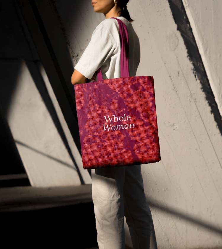
Another detail are graphic patterns in pink and orange that come from microscopic images of healthy breast and uterine tissues, “signifying our commitment to being ‘science-backed’, Ball explains. These are used in graphics for web and social media, as well as on distinctive tote bags.
Tia’s service integrates primary care, gynaecology, mental health and wellness, which means copy is focused on the idea of a service that treats the “whole” woman. A range of illustrations from Maria-Ines Gul introduce each area on the website, while new photography featuring Tia members celebrates “real women’s bodies” Ball says.
The identity has been applied across physical and digital elements alongside clinic interiors by Tia’s new in-house interiors team.
Recommended Posts

NB invites local designers centre stage for Vineyard Theatre rebrand
February 24, 2023

“AI revolution” will change way design studios look within three years
February 24, 2023
Rbl rebrands ZSL with ecosystem-inspired identity
February 23, 2023