Assembly Gin’s protest-inspired identity – Design Week
by IBRAHIM
Assembly Gin’s protest-inspired identity – Design Week
The identity uses a design from Vocal Type, a foundry which uses protest signs of the past to craft new typefaces.
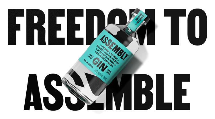
Midday has designed the protest-inspired identity for Assembly Gin, a new spirit from American distillery Republic Restoratives.
Women-owned and crowdfunded, the distillery aims to “celebrate an outspoken and disruptive attitude towards the production of quality American spirits”, according to its website.
The identity for Assembly hopes to conjure “a voice that speaks up and promotes ‘freedom of assembly’ in the wake of draconian anti-protest bills”, explains Midday creative partner and co-founder Will Gladden. “Freedom of assembly” often refers to people’s right to protest, as outlined in the first amendment of the US Constitution.
This tied into both the distillery’s purpose and also the craft of making the gin by mixing botanical ingredients, explains Gladden. This influenced a guiding principle and tagline for the gin, that it is a “spirit greater than the sum of its parts”.
A blend of protest and botanical cues

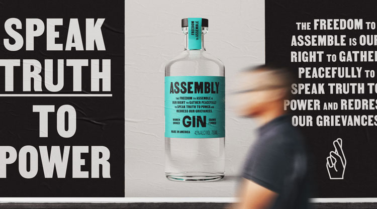
The design team was inspired by protests and related imagery when building the brand; “the idea of taking a stand and having your voice heard,” Gladden explains.
For example, the typeface is Vocal Type’s Martin (named after Martin Luther King Jr.), which was inspired by 1968’s Memphis sanitation strike. Vocal Type foundry delves into the protest signs from history to design bespoke typefaces.

Protest posters – including the famous “I am a man” sign from the 1968 Memphis strike – have inspired the look and feel of Assembly’s branding more widely, explains Gladden.
While Assembly’s turquoise colour scheme embraces the “botanical feeling” of gin branding, it is then overlaid with “quite blunt typography”, the designer says. “It’s a modern interpretation of protest language,” he adds.
That extends to the brand’s tone of voice, as seen on on the packaging and the website, which has been crafted to exist as “a part of that protest world”, Gladden adds.

Combined, those elements have been designed to mimic a flyer that you might find at a protest, according to Gladden. “We were trying to create a flyer that was then wrapped around the bottle,” he adds.
Midday – which has offices in London and Vancouver – previously rebranded the distillery, crafting a logo depicting two fingers which represent “togetherness”, Gladden says. This logo appears on Assembly’s packaging as well, on the top of the bottle top.
What do you think of the identity for Assembly Gin? Let us know in the comments below.
Recommended Posts
Norfolk Coast logo and identity by Lantern
November 23, 2023
SeidrLab visual identity by Mubien Brands
October 16, 2023
Jarrolds logo and identity by The Click
October 5, 2023