A “timeless” new identity for Conran and Partners
by IBRAHIM
A “timeless” new identity for Conran and Partners
At the heart of the architecture and interior design practice’s new identity is a monogram and a characterful typeface.
To coincide with the relocation of its London office from Shad Thames to Farringdon, Conran and Partners has undergone a rebrand, carried out by design studio DutchScot.
The architecture and interior design practice, founded by the legendary Sir Terence Conran, recruited London-based DutchScot to rework its identity, which they felt had become outdated.

“Early discussions were focussed on what their current identity wasn’t doing for them as well as how they differ to their competitors and their ambitions for the rebrand,” says DutchScot co-founder Alex Swatridge.
“The fact that they so seamlessly combine architecture and interior design was one of these distinctive aspects,” she adds.

Building on this history, DutchScot wanted to devise a design that was “timeless” and “spoke to the lifestyle side of the business as much as the architectural”.
This led the studio to using a monogram, which could be stamped onto products and would “become synonymous with the practice going forward”, Swatridge adds.

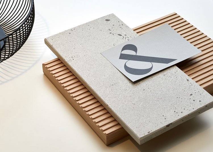
The design of the monogram itself is composed of the letters ‘C’ and ‘P’, which are seamlessly joined to form an ampersand. Swatridge explains that a lot of typographic exploration was carried out to find the best way to execute this idea, and how to make the monogram contrast with the new brand typeface.
The typeface the studio ended up using is Styrene by Commercial Type – a sans serif that “has character, but also means business”, and was the perfect foil to the flowing curves of the monogram.

Together, these elements form an identity that feels both classic and contemporary, and one that rebels against the generic and “forgettable” word marks that are so prevalent among architecture practices these days, according to the designer.
Reflecting on the project, Swatridge says: “It was obviously a dream job to work with such an iconic studio, and one that we have so much respect for in terms of both their process and output.”
She adds: “We’re delighted with the results, there is a modernity to the execution but one that will hopefully stand the test of time, whilst also feeling inherently befitting of the practice.”

What do you think of the rebrand? Let us know in the comments below.
Recommended Posts
Norfolk Coast logo and identity by Lantern
November 23, 2023
SeidrLab visual identity by Mubien Brands
October 16, 2023
Jarrolds logo and identity by The Click
October 5, 2023