“A question of efficiency”: the design of symbols over the centuries
by IBRAHIM
“A question of efficiency”: the design of symbols over the centuries
From heraldic crests to the humble woolmark, author Collin Salter delves into the design and success of powerful symbols that have appeared across the world.
“The notion of symbolism is amazing because you can embody meaning in the simplest of things,” says Colin Salter, author of the recently published 100 Symbols that Changed the World.
His latest book delves into the origins and stories behind symbols that have played an important role in human culture and every-day life. Ranging from 18,000 BCE to 2020, Salter seeks to explain the creation of symbols across the centuries and explore the impacts they have had.
Origins of “deliberate design”
According to Salter, most of the earlier symbols in the book were “instinctive” in nature and would not have involved a design process. The rise of heraldry, following the Norman Conquest of Britain in 1066, presents the earliest examples of “deliberate design”, says Salter.
The book notes that, within a century of the Conquest, the use of coats of arms had become “formalised and widespread”. Heraldic symbols were primarily adopted by those who had been in warfare at a high level, as a form of identification, but were later adopted by families of high social status. Crests were made up of several elements – a central shield, the mantling, the helm, the wreath, a motto and sometimes a crest – and the design involved choosing placement of them, as well as the colours and type style of the motto.

From this period onwards, it became clear that the designing of symbols had become more “conscious”, says Salter. He adds that some of the most obvious examples of conscious designs are the hammer and sickle, created in 1895 to represent the union between agricultural and industrial workers, and the Campaign for Nuclear Disarmament (CND) symbol, designed by artist and nuclear weapon opposer Gerald Holtom in 1958.
Holtom’s first instinct was to use “the Christian cross inside a black circle” for the CND symbol. Instead, he decided to “combine the semaphore signals (communication through flag waving) for the letters N and D”, standing for Nuclear Disarmament, according to the book.

Modern challenges to symbolism
In his book, Salter accredits the “unprecedented” demand for symbols in the late 20th century to the “age of the internet”.
One entry is about how the different search engine symbols “arrived at the same solution, which was having something with the world on it,” says Salter. Starting in 1994 with Netscape’s icon design – “a large N straddling the horizon of a planet” – the entry explores how other browser’s followed suit, such as Microsoft’s Internet explorer icon in 1995, followed by Apple’s safari in 2003.
Designing icons for phones and making them “stand out on a screen” presented “a relatively new, interesting design challenge”, Salter explains. Though the emergence of the internet saw an evolution in symbolism, graphic designers like Susan Kare – the creator of the Apple Mac icons and typefaces – made use of what Salter calls “archaic” imagery. Many of the symbols are based off technologies superseded by computers, such as the camera app symbol we click on to take photos, the envelope image that we associate with emails, and the telephone handset that we look for when making a call.

Salter dedicates an entry to the design of the settings icon which depicts a cog, originally introduced by Windows 95 in 1995. Eight years later, Apple adopted the same style using multiple different sized cogs for their system preferences icon. Attempting to buck the trend and go its own way, Google Android’s system – launch in 2007 – used a hammer and wrench icon for settings, switching to a dial for Android 2.0 and to three slider controls for Android 4.0.
“Eventually Android admitted they’d gotten it wrong and switched to the cog symbol like everyone else,” say Salter. He adds that this shows a presence of a kind of cultural “consensus” about which symbols are “natural”, resulting in multiple companies “settling on a sign or symbol that everyone will recognise”.
How symbolic meaning changes
The very first entry in the book is the Swastika, presenting a well-known example of a symbol that has changed in meaning. Until being claimed as the logo for the Nazi Party in 1920, the Swastika was a symbol of wellbeing and good luck for many cultures, including Hinduism.

One of Salter’s favourite symbols is The Jolly Roger, which first appeared on pirate ship flags on the Barbary Coast of northern Africa in 1625. According to Salter, pirates would “raise the flag when preparing to attack” but in modern times it is applied to “labels of poisonous substances” and signage. The skull and cross bones were first put into use on poisonous substance labels in New York State in 1829, according to the book, and is now the “internationally recognised pictogram for toxic substances”.

The clenched fist has been incarnated across several different movements throughout history. Though it featured in some heraldic symbols in the 13th century, Salter says Salter its first official use was in 1848 as “a symbol of the French Revolution”. Following that, it appeared on posters in Hungary during a workers strike in the early 1900s, during the Spanish Civil War in the late 1930s, at the 1968 Olympics as a symbol of black power and defiance, and most recently, it has spread across the world as a symbol of the Black Lives Matter movement.

Salter explains how the smiley symbol started as a symbol of the Peace movement in the 1960s but has since “gone through all kinds of changes”. Now, it has been reinterpreted an “infinite” number of times in the “age of the emoji”, says Salter, adding that society is slowly becoming “conditioned to respond to really simple visual messages without words”.
What makes a good symbol?
“It’s a question of efficiency and what will get the message across,” says Salter. Although most cultures appear to be “very symbol literate”, designers have to be conscious of making things “recognisable with distinguishing features”, he adds.
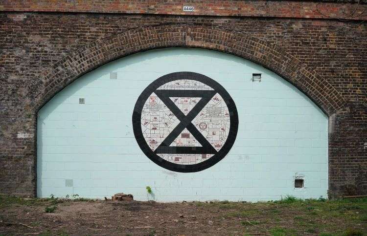
Often, words and letters do not feature in symbols and a more pictorial emblem is preferred, to cater for those who might not be literate. An easy example is pub names, which Salter says, “had to be easily drawable so people could look for the sign”, like the Red Lion or The Kings Head. This was not the case with the Extinction Rebellion symbol, which Salter says is “very effective”.

The symbol was created by an anonymous designer, known only as ESP, who is thought to be a sculptor and printmaker with a history in environmental activism. Salter says that “all you have to do is look at the X and you’re starting to say the name”, adding that the egg timer clearly symbolises “time running out”, representing what the movement is about.
“It always has to be relatively obvious what a symbol is”, says Salter, who references the woolmark which appears on clothing labels as another example. Created in 1964 by Italian graphic designer Franco Grignani – who won a competition (which he was also judging) to do design it – the mark depicts a ball of knitting wool which remains unchanged today.

In line with this “obvious” criteria, some symbols had to change to become more easily comprehensible, such as the flaming torch of knowledge. After being used universally across Britain as the sign for a school for many years, a more obvious and “useful” version which depicted children on it was chosen as a relacement in 1964. This was famously designed by Margaret Calvert and Jock Kinneir as part of their overhaul of British road signs.
Salter says that he’s interested to see “how present-day icons might change” over the years. He adds, “Will an apple always be linked with the tech brand? Will we be talking in emojis and not words in 50 years? Who knows.”
Recommended Posts

NB invites local designers centre stage for Vineyard Theatre rebrand
February 24, 2023

“AI revolution” will change way design studios look within three years
February 24, 2023
Rbl rebrands ZSL with ecosystem-inspired identity
February 23, 2023